Designing LEAD Horizon’s User Experience
Building trust
LEAD Horizon’s COVID self-testing kits are a unique product: while allowing users to relieve some of the restrictions the pandemic forces on them, they simultaneously demand a leap of faith regarding sensitive personal data. Thus, a clear design is essential to show users that our web app is indeed trustworthy and to ensure that it is easy to understand for all users. Together with the Viennese designer Dominik Rummerstorfer, we designed a user-friendly interface that guides users through the testing process as smoothly as possible. This blog intends to explain the elements of the user interface and how they changed during the redesign.
Requirements
A project aimed at such a broad and diverse target group must meet specific requirements regarding accessibility and usability. Despite its own rather stale representation, the Web Content Accessibility Guidelines (WCAG 3) provide the best starting point for designing barrier-free web apps. Complying with these guidelines means people with sensory (e.g., color blindness) or motor impairments can still use the website.
Another aspect of accessibility requirements is to include minority groups, i.e. non-native speakers of German or people who don’t speak German or English at all. However, we also had to consider groups you wouldn’t usually think of as a minority, like people with old mobile phones or low-quality computer screens. All these issues are considered in the design process and influence elements such as fonts and colors.
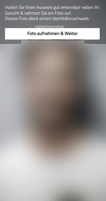
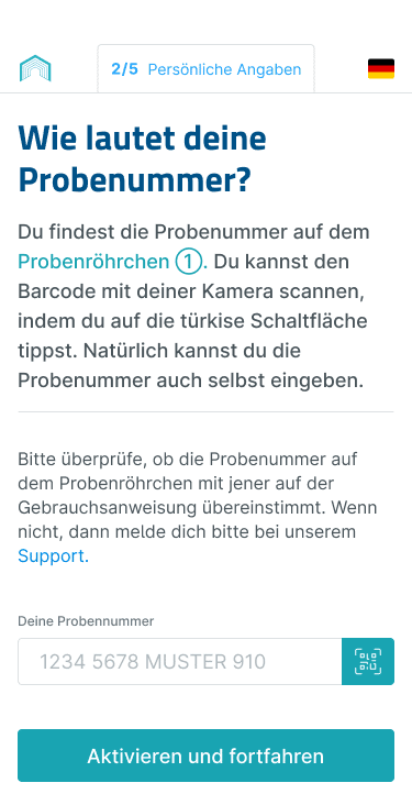
For this project, the process of testing yourself needed to be as quick and simple as possible. We needed to ensure that we wouldn’t create yet another hurdle for the Corona-weary population but a tool that would help people gain some freedom without causing an inconvenience. Usability was the main focus during the whole design process: The web app needed to be clear, concise, and friendly in tone.
With most people using their phones to test themselves, mobile optimization of the web app was, of course, a given.
Communication at eye level
What veteran LEAD Horizon users of previous versions will notice first is the new style of language used. The new texts are penned by Matthias Alber, who aimed to simplify the instructions and bring communication to eye level. In particular, Alber paid special attention to the comprehensibility of texts for non-native speakers. The switch to the German informal “you” lightens up the web app’s voice without appearing too casual. At the same time, Alber ensured not to lose the Austrian idiom, a little charming and tongue-in-cheek, in the wording.
Designing clarity
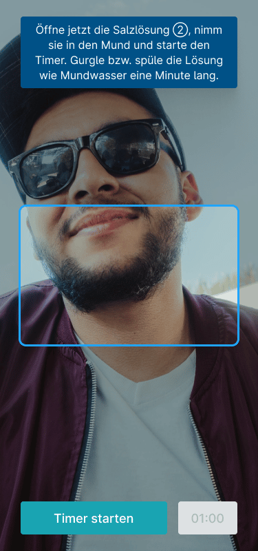
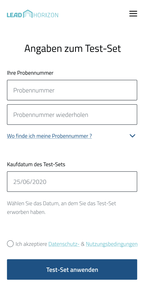
All user flows were reconsidered in the last redesign and discussed, keeping the experience and feedback from the previous versions in mind. We focused on tailoring all inputs to immediate user feedback, such as error messages, help texts, or descriptions, to lower the error rate during data entry. A more distinct status bar, an easier-to-find help section, and a distinct layout provide a better structure to the process. Notably, the rinsing process has been simplified as far as possible and cleared of anything potentially distracting. Overall we improved usability with several quality of life upgrades:
The new version works with a traffic light color system to make information, like the status of tests or error messages, visible and easily comprehensible.
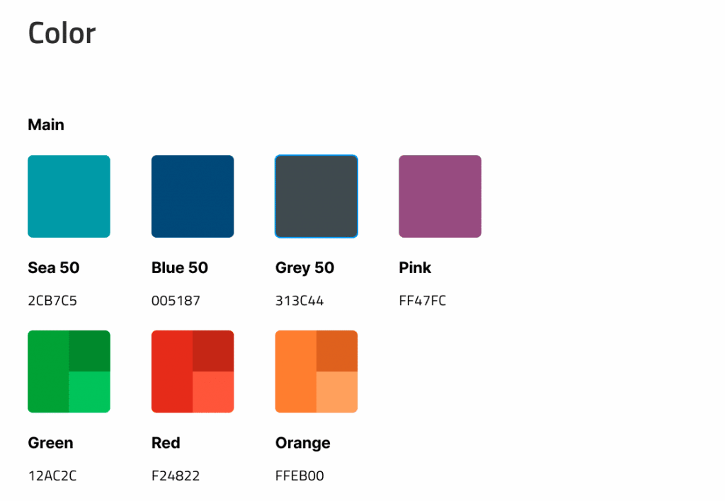
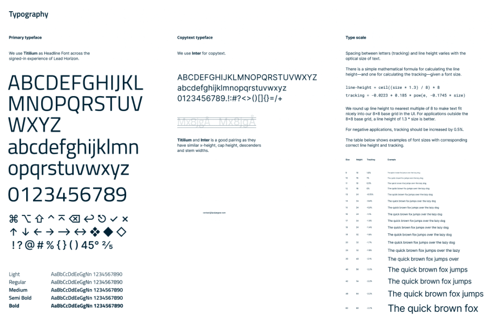
The fonts Titillium for headings and Inter for the body text combine great readability even in small sizes and on low-quality screens. Additionally, they allow the translation of the text into many other languages that might include different symbols, i.e., Turkish or French.
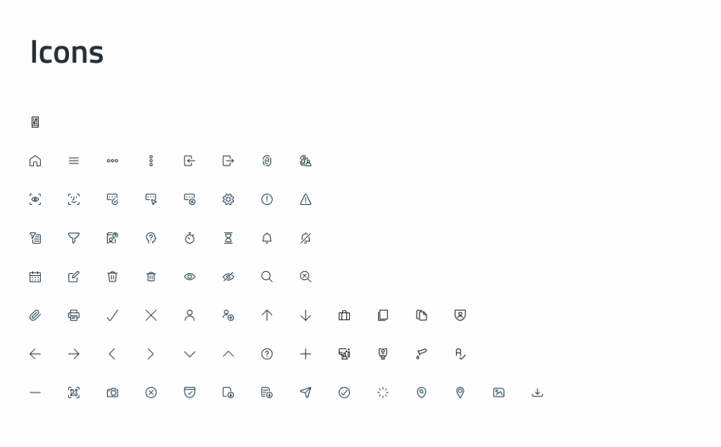
We also implemented an icon set to add some additional non-text-based clarity to the overall design.
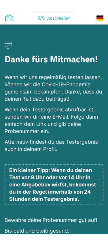
Evolution of a success
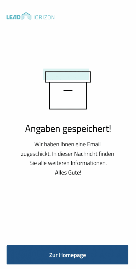
Compared to the prototypes and beta tests, the web app’s design has come a long way. Here are a few before and after images.
Developing a web app tens of thousands of people use every day is quite an adventure. If you’d like to read more about this exciting project, follow the link to our case study.