Digitale Tennisschule
Manage your tennis school with a click
Outline
Challenges
Edge-Cases everywhere
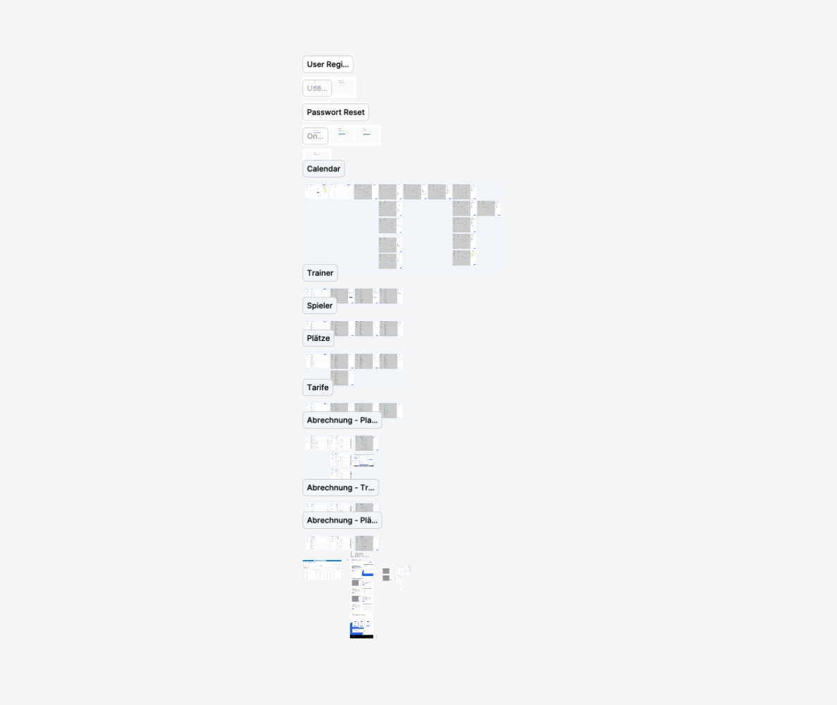
When developing the web app for our client, we were faced with a number of challenges, which manifested themselves primarily in the consideration of numerous edge cases. As this is a SaaS solution, it was crucial not only to cover the central functions of the platform, but also to integrate the many small, specific requirements of the users. Ultimately, the variation in requirements varied greatly from pilot partner to pilot partner.
From managing different training sessions and course offerings to customizing individual training plans, we had to ensure that all possible scenarios were covered to ensure smooth use of the platform.
It was particularly challenging to create a flexible yet robust structure that would do justice to these diverse individual cases. For example, we had to integrate mechanisms that enabled customised settings for different trainers and training groups, such as different pricing, booking options and communication options. Each of these functionalities had its own special cases, which often differed only slightly from one another, but still had to be taken into account in order to meet the high demands of the end users. A balance had to be struck between flexibility and complexity so that the platform remained both scalable and easy to use.
Another aspect of the challenge was to ensure that the SaaS solution remained reliable and performant despite these many customisation options. Edge cases such as managing multiple locations in parallel, integrating different payment systems and ensuring data security required precise planning and constant optimisation. We had to test repeatedly to ensure that even rare usage scenarios would work flawlessly and that the platform would remain stable even under heavy load. Ultimately, this intensive development process resulted in the Digital Tennis School offering a solution that is customised for both coaches and tennis schools without compromising on user-friendliness and performance.
Objectives
No more Excel lists
With the solution, we pursued several ambitious goals aimed at fundamentally improving the day-to-day work of coaches and tennis schools.
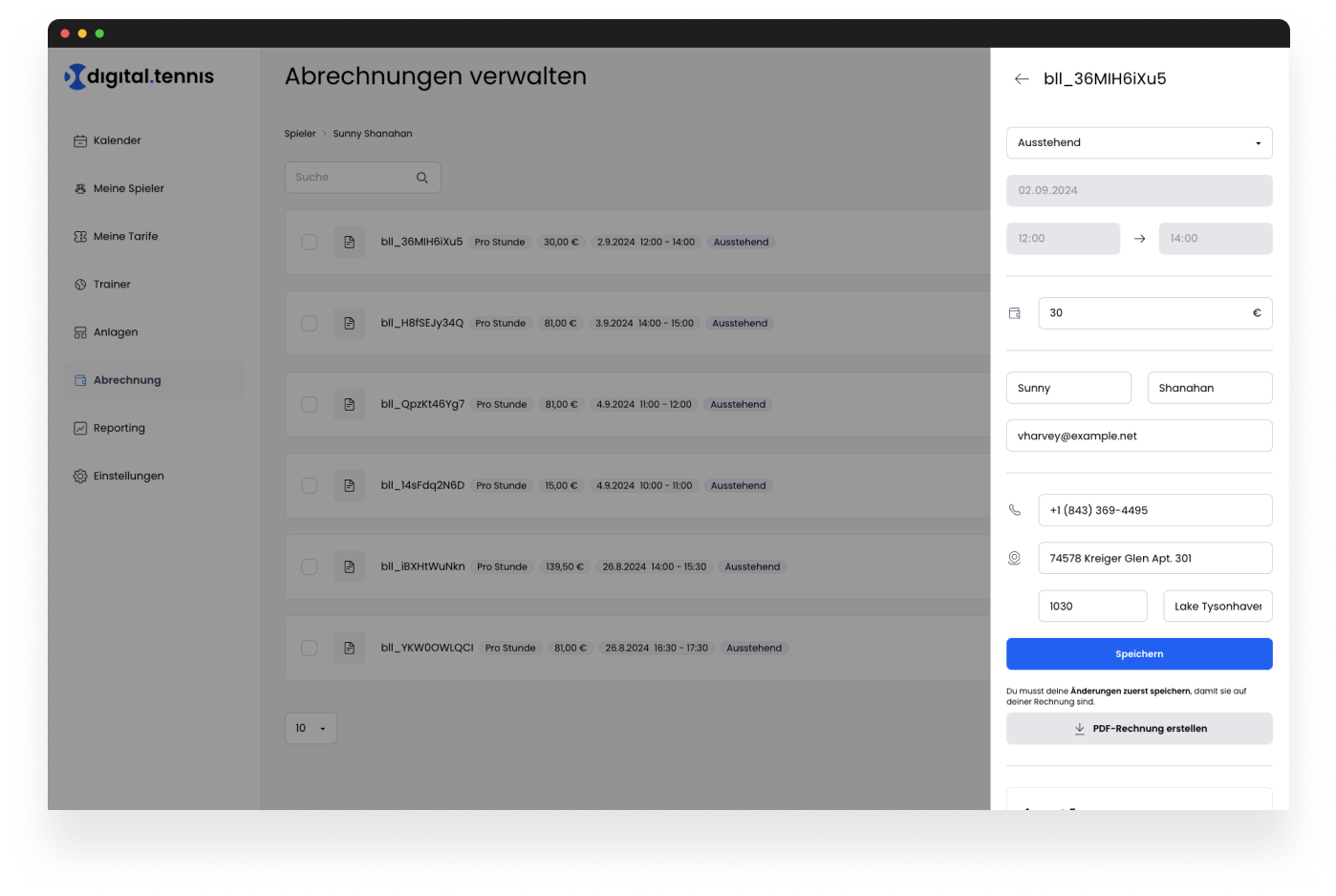
One of the main objectives was to digitise and automate the time-consuming administration of invoices, which previously often resulted in endless Excel lists. We wanted to ensure that billing and financial overviews could not only be processed more efficiently, but also without errors. The platform should enable users to manage all transactions and billing processes centrally and easily, which not only saves time but also minimises the risk of errors.
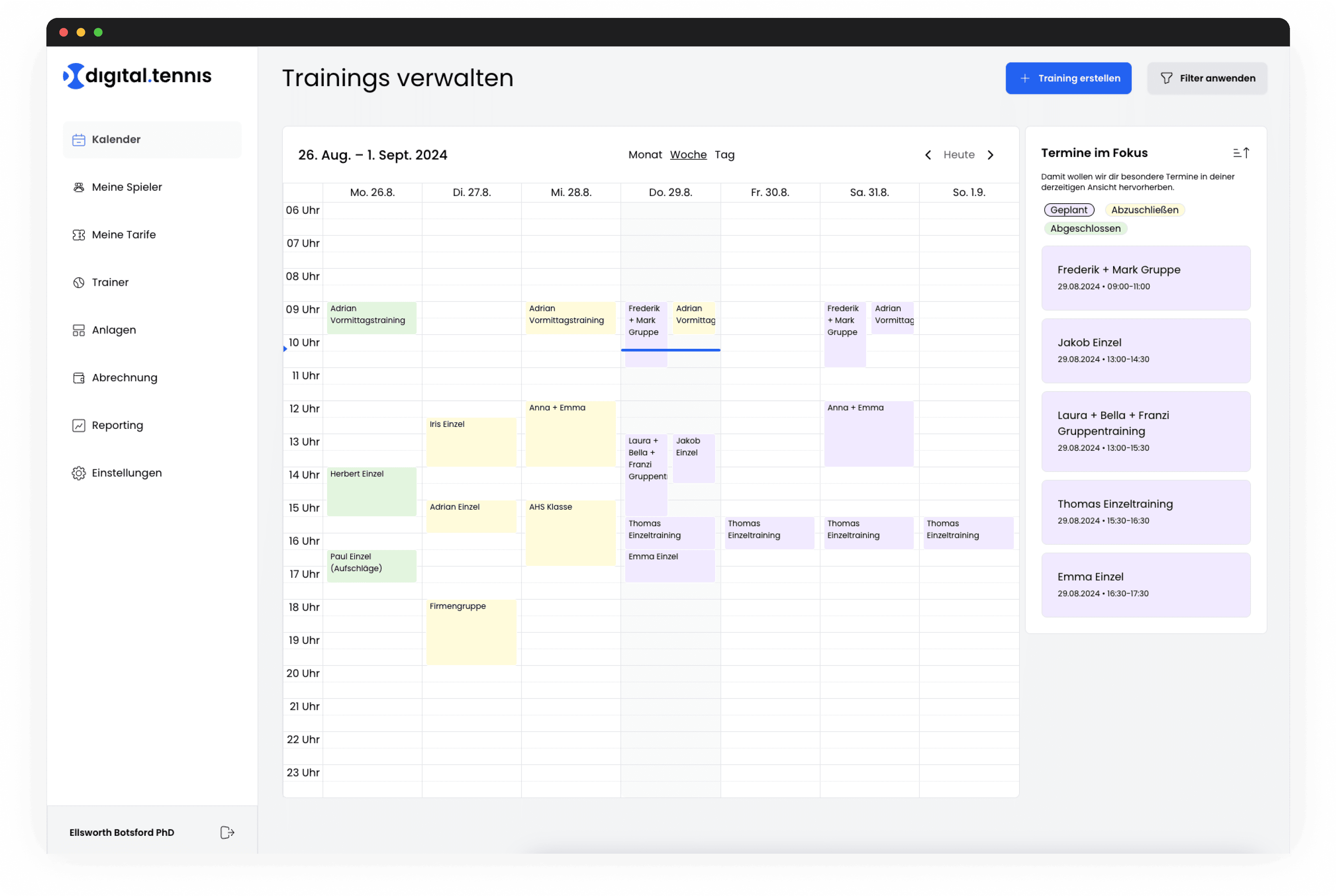
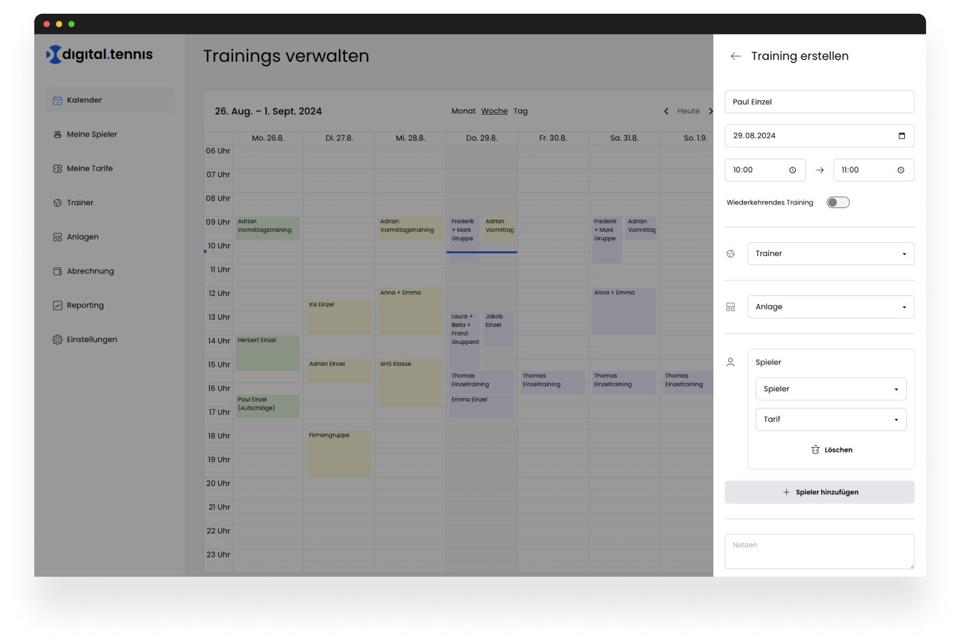
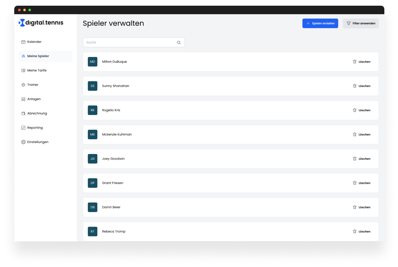
Another key objective was to create a user-friendly solution that was specifically tailored to the requirements of mobile working. Trainers should have access to their training plans and course information at any time and from anywhere so that they can react flexibly to changes. A clear and concise presentation of the training overviews was particularly important to us, so that course offers, participant lists and schedules remain easy to follow. By introducing the sidebar, we were able to implement a feature that could be used for both mobile devices and the desktop. This saved us time in both the design and development of the app.
We also attached great importance to developing an intuitive platform that is largely self-explanatory. The aim was for trainers to be able to use the application without long introductions or manuals. The user interface was therefore designed in such a way that all important functions are clearly structured and easily accessible. This focus on intuitive usability was intended to maximise user acceptance of the platform and make it as easy as possible to get started with digital administration. Ultimately, we wanted to create a solution with the web application that is not only powerful, but also easy and pleasant to use.

Connecting the dots
The product was developed to reduce the administrative and organisational workload of tennis coaches and tennis schools with a customised SaaS solution.
The aim was to digitalise and simplify manual and error-prone processes, such as billing via Excel lists. The platform offers a centralised solution that enables coaches to manage their courses, participants and billing efficiently. Special attention was paid to mobile usability, so that trainers have access to all relevant data and functions at any time and from anywhere.
The user-friendliness of the platform was also emphasised. Thanks to the intuitive design of the interface, coaches can use the Digital Tennis School without a long familiarisation period, which makes it easier to get started with digital administration. The solution not only offers a clear and concise presentation of training and course overviews, but also ensures that complex processes run automatically in the background. As a result, we have succeeded in developing a platform that both makes users' everyday lives noticeably easier and fulfils the requirements of modern, digital administration.
Digitization of billing
The platform replaces manual, time-consuming processes, such as billing via Excel lists, with a fully automated and centralised solution. This not only saves time, but also significantly reduces sources of error and creates a transparent overview of financial processes. Users can manage all invoices, payments and participant data in one place without having to deal with the complexity of manual calculations.
Be able to plan at any time
Another outstanding advantage of the platform is its consistent focus on mobile use and its user-friendly design. Trainers can access training plans, participant lists and course overviews at any time and from anywhere, which provides enormous flexibility. At the same time, the user interface has been designed so intuitively that the application is immediately understandable without extensive training, which significantly increases user acceptance and facilitates daily use.

Uncomplicated and effective
It was a very fast, uncomplicated and, above all, effective collaboration. The short communication channels allowed us to develop the product on a high pace and quality.
Lukas Persterer, Founder and CEO
Achievements
15
weeks from kick-off to go-live
20+
hours tennis schools now save weekly
epunkt
We partnered with epunkt to build a modern job and client platform on a stable technical foundation, fully integrated with Salesforce as the single source of truth.
Fixmetall
Your small-scale steel or metal is one click away. Discover over 10,000 products and have them precisely delivered straight to your home.
Zurich - LiLi
The LiLi application is a fast application to classify, index and validate documents across different input channels.
LEAD Horizon - Alles Gurgelt!
LEAD Horizon wanted to bring highly intuitive, safe and fast PCR testing into people’s homes. We developed the Web App that made “Alles Gurgelt” possible.
whoranks
In a world where LinkedIn has become a powerhouse for networking, branding, and thought leadership, understanding your influence and engagement on the platform is crucial.
Vengolino - Vienna Red Cross
Tasty, healthy & personal, "Vengolino" for short. The food ordering app from the Vienna Red Cross.
timebite
timebite is a crowd-based learning platform where students share their learning tips for exams and reflect on their learning behavior through individual statistics.
Quinn - TU Vienna
Quinn is a native ECTS evaluation app that we developed together with the Vienna University of Technology to improve ECTS equity and studyability.